Time To Go
Time To Go

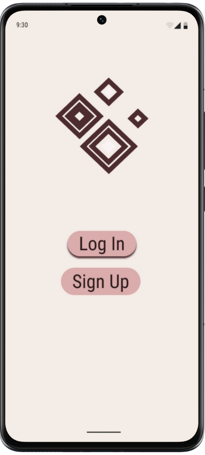
Time To Go App Prototype
An app to help users start their airport trips on time
About TimeToGo
-
Airports. They're not the most pleasant place to be (especially in the US). From getting stuck in seemingly endless lines to navigating complicated layouts, there are several reasons why many people dread this portion of their travel experience.
-
My app concept is meant to help users with the first—and last—leg of their journey by calculating how much time users will need/want to spend onsite and providing recommendations for timing.
-
Research, User Interviews, Design, Wireframing, Prototyping, User Testing
-
September 2024 - February 2025
Before I could even begin to design anything, I had to conduct my research. I already had several ideas regarding what sort of issues I wanted to tackle; the key was to find one to focus on.
Research and Development

User Stories

User Persona
Common airport issues included:
Long lines
crowds
Poor infrastructure
Once I had gathered my research and received feedback on my progress, I honed my idea into a specific target: timing. One of the easiest ways to make the airport experience easier is by minimizing the amount of time spent in the airport. Based on the user's preferences regarding transportation, checking in, shopping, and dining, the app would give recommendations for the best time to leave and give rough estimates for how long each leg of the journey would take.
From here, I could move on to the design of my app.
Design
The first step in figuring out what I wanted my app to look like was to develop the layout. Using a pen and paper, I crafted rough sketches of what I wanted my app to look like. Doing this by hand helped me to focus less on the minute, unimportant details and more on the basic functionality.


From my sketches, I made my wireframes. I deliberately kept the design minimalistic, so it would be easy to learn and look clean.

I wanted my design to come across as welcoming and usable but with an air of professionalism. I chose to use the pink color because pink has been known to be a relaxing color. I avoided using pure white because I feel it can come across as too sterile.
Moodboard

High Fidelity Wireframes
While developing my high fidelity wireframes, I found that some aspect were above my skill level to implement, so I simplified some of the pages. Mainly, the add flight page has fewer steps. I also gave the preferences and Itinerary pages a much cleaner layout
Usability Testing
Problem: The sample flight confused users into thinking they had already entered their flight info; button language was unclear


Solution: Remove sample flight and make the buttons much more specific (also added imagery for visual appeal)
Problem: The lack of a title/caption made it difficult for users to figure out what exactly the app was selling
Solution: Add app name and a caption

Conclusion
It’s important to hone your idea from the beginning. Going in with too broad of an idea can leave you feeling trapped on a crossroad going in too many different directions. While having an idea with some wiggle room is also important, you don't want there to be too much room. You also need to be assertive when recruiting. If you're too timid when recruiting participants, you get nothing done. Right off the bat, give them your pitch and a window of time to work within. Take initiative. When it comes to the design itself, being too simple may come back to bite you. Minimalist designs may look clean and easy to use, but they can also be sterile and bland. One discovery I was glad to make is that there's always someone willing to help you when you need it.Whether it's kind strangers, coworkers, friends, or family, there is always someone out there who is willing to give you whatever help you need at every stage of your journey.