Muze
Muze

Muze App Prototype
A project to practice incorporating a subscription option into a freemium app model.
Muze
-
A media streaming app has been using its free version to build their user base. Now, they want to encourage users to upgrade to their premium version.
-
Add calls to action for new and returning users to subscribe to the premium app experience.
-
User flow, app design, prototyping, user testing
-
Research: Mar 27 - Apr 5
Designing: Apr 6 - Apr 8
Validating: Apr 9 - Apr 16
Designing: Apr 16 - Apr 18
Validating; Apr 18 - Apr 27
Designing: Apr 27 - Apr 30
Competitive Analysis
Spotify:
Music, Podcasts, Audiobooks
clear CTAs (link to premium on the main menu page)
no in-app upgrade


YouTube:
Video & Music Streaming
simple in-app checkout progress
takes multiple steps to find the page with info on premium


Pandora:
Music & Podcasts
easy-to-find upgrade CTA
quick & easy checkout
bright & cohesive color scheme


Quantitative Research Results
Goals/Needs:
features that justify the subscription price
quaity content that retains the user base
Pain Points:
overly complicated subscribing process
lack of communication with users
Frustrations:
Over-advertising subscription
Going from no ads on free platform to paid ad removal
hiding previously free content behind a paywall
Motivations:
Exclusive content
Ad-free streaming
Offline Streaming
Bundle with other streaming services
Design
color palette was developed using a technique from Joseph Angelo Todaro
UI elements were pulled from Figma’s Simple Design System & edited to match the chosen font & palette
Poppins was chosen as it is a recognizable and clean font, while Russo One was chosen as the title font for its futuristic edge

User Flow
My goal in plotting the user flow was to keep it as simple as possible. As stated in my research findings, an overly-complicated process is a pain point for users

Low Fidelity Wireframes
Using the Existing Wireframes, I expanded on the design, adding wireframes for the different steps of the user flow.

High Fidelity Wireframes
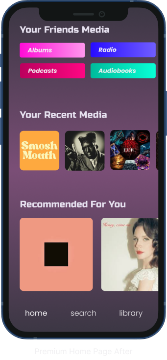
After performing usability tests using the low-fidelity wireframes, the style guide was implemented into the high-fidelity designs. A major design takeaway I received was that there needed to be a stronger call to action for returning users, so a tooltip was included on the home page

One of my testers observed that having the Premium ad pop up during the sign-up process for new users is seen as invasive and ineffective, so it only appears after returning user login

Usability Testing
Instant visual gratification was highlighted as a must-have by multiple testers, so the premium page was given a slightly more prominent gradient

Yearly tab was removed because it was never turned into a clickable tab, and the majority of testers were confused by it


Users observed that a cta on the new user’s home page would be beneficial in encouraging them to subscribe, so a tooltip was added.


Before
After
Before
After
Before
After
Conclusion

It doesn’t take much to have a successful subscription incorporation. It’s important when creating a CTA to make sure it’s noteworthy enough to draw attention but not overtly to the point where it’s obnoxious.